Project Overview
Re Designing the Pit Surface Designer
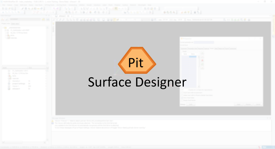
The pit surface designer generates full pit outlines from a pit bottom or top. It expands upward and out or downward and in. It also automatically designs structures, such as dumps, by expanding upward and in or down and out.
Re designing should group with new the design elements and libraries that will allow to develop consistent UI across products. It should adapt the guidelines, components, and tools that support the best practices of user interface design.
It should fallow a robust set of standards and usability patterns to ensure consistency across all platforms.
Role
Product research, user interface design and interaction design.
Current Design Issues
MISUSE OF MODAL WINDOWS
In the tool model windows are used like permanent controls for the user to achieve any particular goal.
WHEN TO USE MODEL WINDOWS
1 - When it can be used to prevent or correct critical errors.
Whenever there is a chance that users’ work be lost or that an action may have destructive, irreversible consequences, interrupt the users to avoid a disaster.
2 - When it can be used to request the user to enter information critical to continuing the current process.
When missing information prevents the system from continuing a user-initiated process, a modal window can prompt the user for that
information.
3 - When it can be used to fragment a complex workflow into simpler steps.
When it comes to workflows, faster isn’t always better. For time-consuming and mentally involved tasks, it can be overwhelming to ask for lots of information all at once. In those situations, modal windows can be used to break complex information up into simpler, more digestible chunks.
4 - When it can ask for information that, when provided, could significantly lessen users work or effort.
Modals can work effectively when the information being requested or presented is relevant or can streamline the completion of the current task.
WHY NOT TO USE MODAL WINDOWS
1 - They require immediate attention.
Modal windows, by their nature, are compulsory and require the user to act immediately. Since the modals place the system in a different mode, users cannot continue what they are doing until they acknowledge the modal.
2 - They interrupt the user's workflow.
Modal windows force users away from the tasks they were working on in the first place. Each interruption translates in lost time and effort, not only because users must address the modal, but also because, once they go back to their original tasks, they usually need to spend time recovering context.
3 - They cause users to forget what they were doing.
Once the context is switched to a different task, because of additional Cognitive Load imposed by the modal window, people may forget some of the details associated with the original task. If that is the case, recovering context for the original task may be even more difficult.
Cognitive Load
Just like computer, Human brains have limited amount of processing power. When the amount of information coming in exceeds our ability to handle it, our performance suffers. We take long time to understand the information, miss important details, or even get over helmed and abandon the tasks
4 - They cause the users to create and address an extra goal to dismiss the modal.
When the modal is presented, extra steps are added to the user’s workflow: to read and comprehend the dialog, then make a decision on that modal. This increase in interaction cost is likely to put off users, unless the dialog is well justified and indeed contains important information.
Interaction Cost
The interaction cost is the sum of efforts (mental & physical) that the users must deploy in interacting with a product to reach their goals and objectives.
Ideally, we would like users to consume the product and find the answers they are looking for right in front of their eyes. That would be zero interaction cost and is the whole point of usability.
5 - They block the content in the background.
When a modal appears on top of the current window, it can cover important content and remove context. As a result, it may become harder to respond to the modal when the modal asks a question related to information that was just obscured.
MODAL WINDOWS CLASSIC ANATOMY
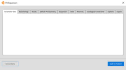
The way the model windows are been used disrespect the model window anatomy guidelines
CURRENTLY
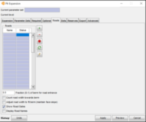
The controls located at the footer have mixed influence in the state of the model as well as in the main context, which causes confusion.
Cancel Button
you would expect the cancel button to close the model window and cancel any previous decision made while the model was opened. Not only the cancel doesn’t close the modal but neither cancels changes made.
Undo & Preview Buttons
These buttons are misplaced, it's not clear what they would do assuming the user is in any tab other than expansion.
IDEALLY
Modal Header
It offers to the user the option to quickly resize, cancel or dismiss the contents of the modal. If an action is required, this control would be disabled.
Modal Body
The body should contain all the information and controls necessary for the user to make the requested changes or provide the necessary information to the main context.
Modal Footer
The footer provides controls that allow the user to acknowledge, confirm, cancel and or apply changes made in modal back into the main context.
TABBED NAVIGATION
Around 43% clicks in the current product happen because of the tabbed architecture.
WHEN TO USE MODEL TABBED NAVIGATION
1 - To alternate between views within the context.
Not to navigate to different areas. This is the single most important point, because staying in place while alternating views is the reason we have tabs in the first place.
2 - Logically Chunk.
Chunk the Content behind the tabs so user can easily predict what they will find when they select a given tab (Card Sorting is one option for researching this Mini-IA problem. If you don’t find clearly distinct groupings, then tabs are likely the wrong interface control for managing your content).
3 - When users don’t need to see content from multiple tabs simultaneously.
If users do need to compare or refer to information behind different tabs, then having to switch back and forth puts an added burden on their short term memory, increases cognitive load and interaction cost, and lower usability compare to a design that puts everything on the big view.
CARD SORTING
Is a technique in UX where a dendrogram (Category tree) gets generated. It is extremely useful approach for designing information architecture, workflows, menu structure and navigation paths in general.
Mini-IA
The definition of Mini-IA(Mini Information Architecture) is simple. Its how you structure the information about a single topic, concept, product or article. For example the definition box you are reading now has the simple possible Mini-IA, A single and linear presentation of the information.
SHORT-TERM MEMORY
People can’t keep much information in their short term memory. This is especially true when they are bombarded with multiple abstract or unusual pieces of data in rapid succession.
When it comes to abstract thinking, humans have extremely limited brainpower. Short-term memory famously hold only about 7 chunks of information, and these fade from our brain in about 20 seconds.
Proposed Solution
Card Sorting
With demo material, documentation, manual and after a few charts with stakeholders we felt that card sorting would be a good start.
The main goal of the activity was to improve the name convention of the tabs as well as re organise its contents.
The result was small improvement far from ideal, but an improvement. Now the tabs made a little bit more sense.
Tabs are evil
Taking in consideration all the usability heuristics and guidelines as well as all the research material from Nielsen Norman Group, we decided to get rid of the tab system
Its isolated the content in proper containers which improved the organisation, but at the very same time created a huge burden on the user, making the workflow even slower.
Not to mention that the amount of concurrent modal windows would completely shade the main content.
Modal are also evil
It was clear we wouldn’t improve the UX by only re organising and converting tabs into modal windows, so we investigated how products with complex interface deal with this type of problem.
Some of the products we look into:
Tinkercad - Solidworks - AutoCAD - FreeCAD - TurboCAD2016 - Deluxe - Creo Parametric 3D - IronCAD - Shapr3D - Fusion 360 - BricsCAD - OpenSCAD - VariCAD - SolveSpace - Blender
and even other products not directly related like:
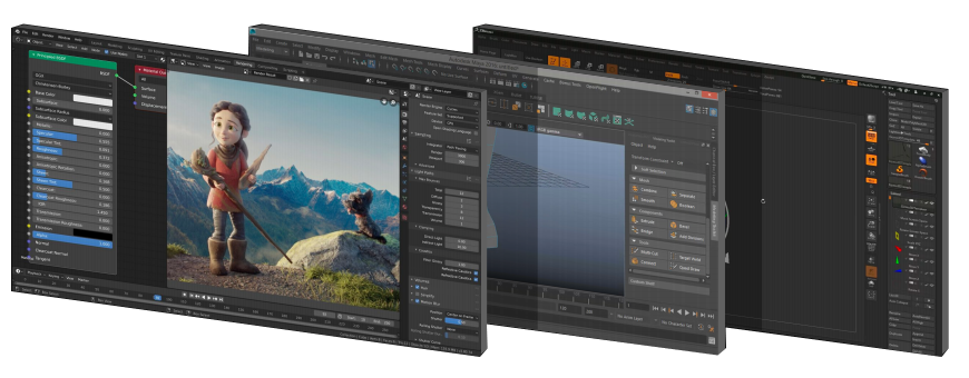
Illustrator - Photoshop - ZBrush - Autodesk Maya
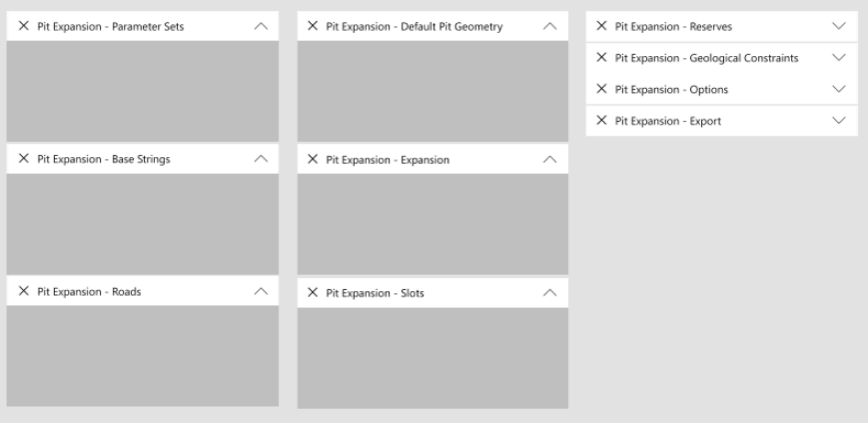
Panels are the way of future
Every single one of the tools mentioned solved the complexity of the UI using panels, digging deeper we found why:
It is impossible to predict the workflow for such dynamic tools, even a minimal change of scenario can completely change the workflow
Crafting the UI using panels would allow the user to define what is the best workflow for every single scenario.
It has to be dark
The dark theme make the UI blend better, allowing the user to have a better focus after long periods of exposure to the product.

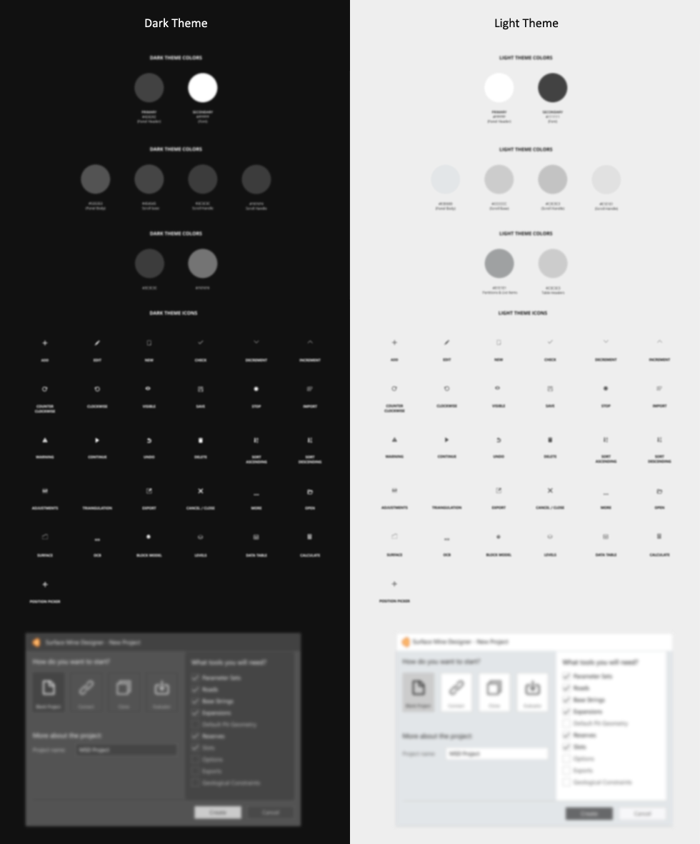
Dark Theme
The Dark theme emit low levels of light while maintaining a high standard of usability. It does utilise dark gray as primary surface colour for components
It reduce the eye strain, as light text on a dark gray surface has less contrast that light text on a black surface
"59% of users report experiencing symptoms of digital eye strain on light theme"
FOCUS
Engineers can benefit from using the Dark Theme because it allows the interface to fade into the background and the content to come to the forefront. As a result, core elements of the user interface can stand out and gain prominence.
FAST SCANNING
The natural property of the dark theme to absorb some of the light from the other elements reinforce the ability to comprehend information in a glance, One of the reason why Dark Theme is so popular among analytical tools, where users need to quickly understand the situation.
How it Looks
Colours and Icons
