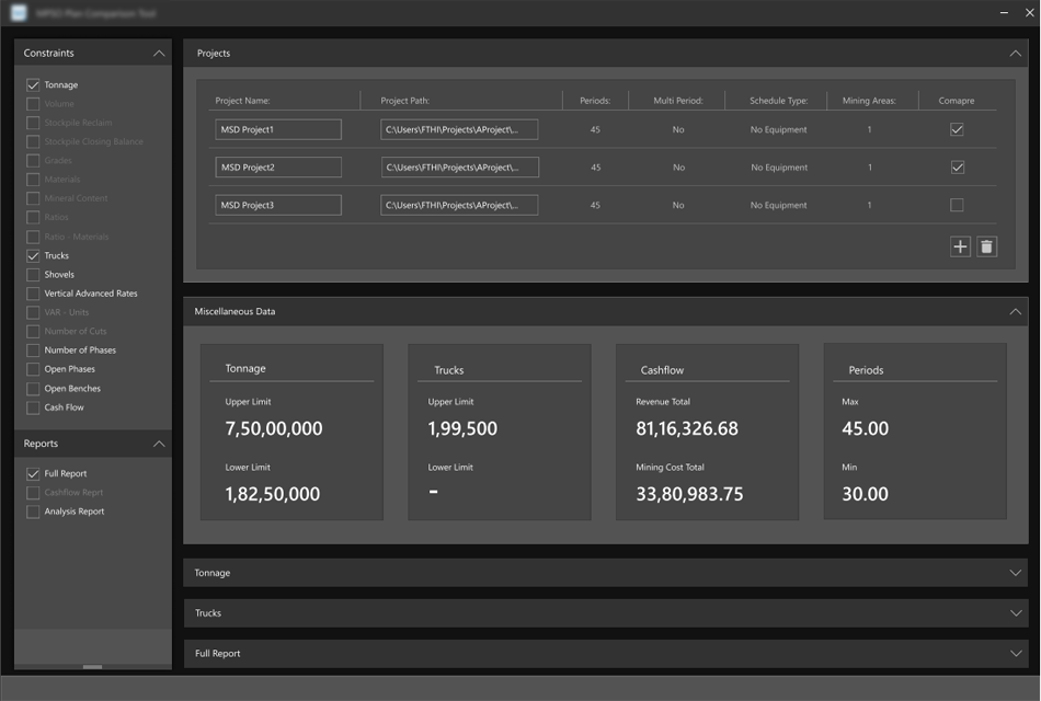
Re designing should group with the proposed design elements and libraries that should adapt the UI from the preceding products. It should follow the guidelines, components, and tools that support the best practices of user interface design to ensure consistency across all the products.

Project Overview
Mine engineers, Geologists and mine planners use plan comparison tool to compare diffrent mining projects and decide which one is more optimal to use.
Role
User research, user interface design and interaction design
Goal
The main goal of the project is to compare different schedule optimized projects in a single tool, where the user can compare many constraints and cash flow reports
Who are the users and why they use
Mine Engineers, Geologists and mine planners to compare various optimized mining project schedules and decide which one is more optimal and can go with it.
Understanding the users and their requirements on the tool
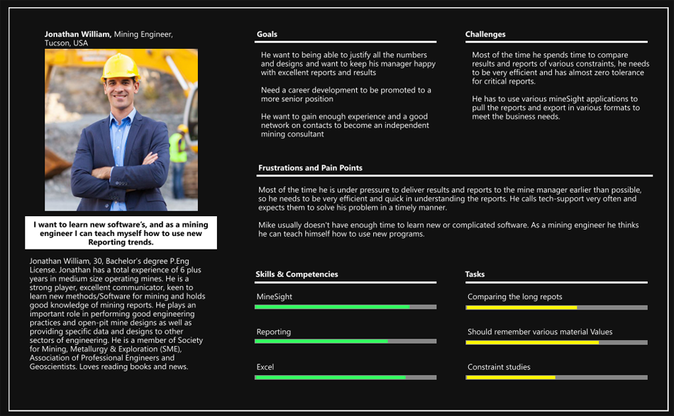
As there was no direct access to user feedback from PO's and SME's was key source of information developed some hypothesis out of it and tried to develop personas
Senior Engineer Persona
Junior Engineer Persona
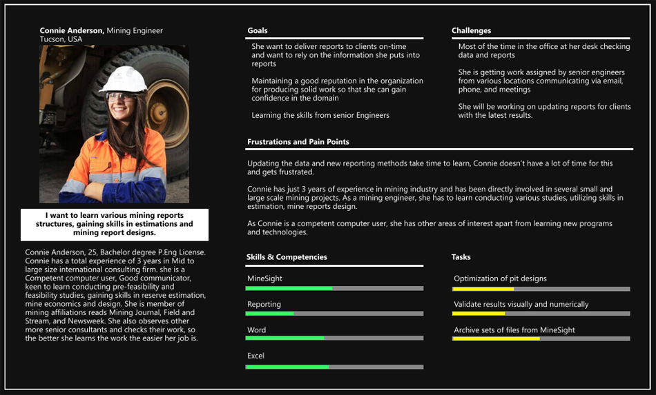
The user personas have gave me more insights about the user interaction with the tool and their challenges in using the tool, which made me to get onto the users shoes and walk through the current tool.
Current Design Issues

1 - PRESENTING THE DATA IN LISTED GRIDS
In the current design list view grids are used as content sources, to find the information the users have to take deep dive into the various lengthy grids to perform the comparison.
List View Lists present multiple line items vertically as a single continuous element. It’s text heavy
and usually have only small images with more text. List view items require less vertical space than an image would, allowing more list items to be displayed on the screen at a time.
Content Scanning List view provides users a format that fallows their natural reading pattern like the F-shaped pattern.
Content Scanning List view provides users a format that fallows their natural reading pattern like the F-shaped pattern.
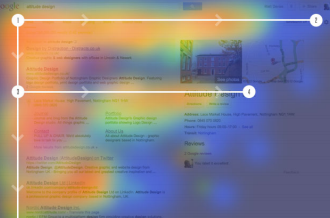 |
Eye tracking visualizations shows that users often read web pages in F - shaped pattern: two horizontal stripes fallowed by a vertical stripe. F for fast. That's how users read your content. In few seconds, their eyes moves at amazing speed across your content in a pattern. |
Lists are best suited to presenting a homogeneous data type and optimized for reading comprehension. List view prevents too much scrolling by making pages shorter. The exclusion of images allows you to fit more content per screen.
Decision Making Users rely primarily on reading the text to make their decision is regarded as the cognitive process resulting in the selection of a belief or a course of action among several alternatives and also the process of identifying and
choosing alternatives based on the values.
Pros and Cons of List Grid
list view has following Pros:
List view follows natural reading patterns.
List view prevents over scrolling by providing more options in a visible area.
But it also has a few disadvantages:
List view is very modest in case of visual appearance.
In the list view user’s attention decreases from top to bottom
2 - COMPLEX INTERACTION
The way the UI controls are been used are complex and user have to use cognitive load and motor skills to perform the tasks.
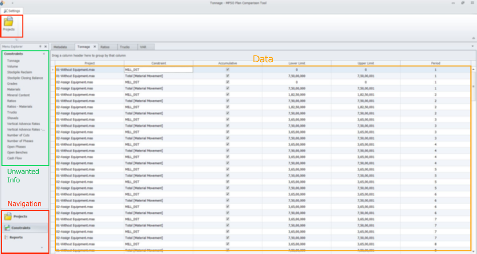
Navigation missing Law of Proximity
Law of Proximity states when objects are close to each other and they tend to be perceived together in one group. Basically proximity is closeness. if we use clear structure and visual hierarchy we will be less charged by the limited cognitive resource of users, so they wiil be able to quickly recognise and react
The controls located at various locations and have different interactions against the proximity of the controls which cause confusion to users how to navigate with the tool and also increases interaction cost
The interaction cost is the sum of efforts - Mental and physical - that the users must deploy in interacting with a site in order to reach their goals.
Un Wanted Information
Un wanted information is displayed in the tool which is not required, users are often distracted from the information which is not useful. Information is overloaded describes the excess of information available to a user aiming to complete a task or make a decision. This impedes the decision-making process, resulting in a poor decision being made.
Huge data to compare
Huge data is difficult to perceive, users have trouble sorting through the data presented to them and routinely make bad decisions, the more choices presented to a user, the longer it will take for the user to make a decision. In present scenario the users have to use Fine motor skills along with Cognitive skills to perceive the information, understand and compare it.
Fine motor skills refer to the ability to perform precise movements that involve the small muscles in the wrist and fingers. Grabbing an object with the thumb and the finger and moving the object to the desired location.
Cognitive skills are the core skills your brain uses to think, read, learn, remember, reason and pay attention. Working together they take incoming information and move it into the knowledge you use to perform some task.
Cognitive skills are the core skills your brain uses to think, read, learn, remember, reason and pay attention. Working together they take incoming information and move it into the knowledge you use to perform some task.
Un Wanted Controls
The less users have to think about the interface or design, the more they can focus on accomplishing their goal on the product. the controls should give them a straight path to their goal by clearing out the obstacles beforehand.
The less users have to think about the interface or design, the more they can focus on accomplishing their goal on the product. the controls should give them a straight path to their goal by clearing out the obstacles beforehand.

3 - TOUGH TO COMPARE DATA
The main purpose of the tool is to evaluate the data and get the relevant information about the different mine schedules.
Before we dig into the comparison problems with the present tool lets refer some comparison examples in the present trend.
Before we dig into the comparison problems with the present tool lets refer some comparison examples in the present trend.
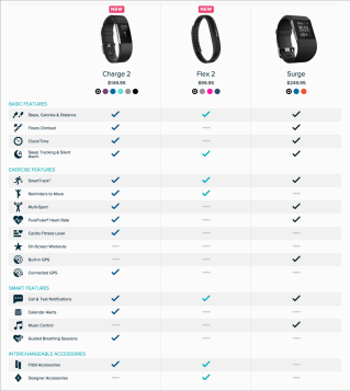
| Scannability Support | Give users control |
 |
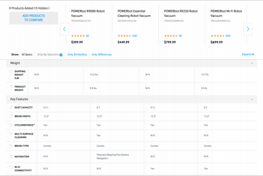 |
| Comparing cons and pros of different products is a cognitively demanding process. We have to make sure your users can focus on their needs. An effective way to do this is to make the data easy to scan for differences, similarities, and keywords through pictorial representations. | Even after making the entries scannable with the sticky headers sometimes it can be difficult for users to compare products with several attributes. In those situations, users may have to scroll back and forth between different rows as they compare the pros and cons of different products. In order to make the task manageable, consider allowing users to select which attributes they want displayed in the table. Collapsible rows are an easy implementation for this feature. Additionally let users hide rows for which all offerings are similar, and only show the differences. |
Factors which effecting the comparison in between the information in the present tool.
| 1 - Discoverability In the current design the user have to click on the constraints tab and choose the relevant constraint and go deep into the various columns in the data grid to perform the comparison, the user doesn’t have any clue of which constraint have got the data to compare. |
With regards to interface and product design, is the level of ease with which the user can discover every component and feature in a new product when they first experience it.
|
| 2 - Redundant steps Every time the user has to go to the projects tab to add or delete the project to compare. To this he have to leave the current tab and comparison of the projects and have to start again from selecting the constraint and do the comparison. user doesn’t have any trace of previous actions. |
User interface complexity increases when a single feature is presented in multiple ways. Users rarely understand duplicates as such, and often waste time repeating efforts or visiting the same page twice by mistake.
|
| 3 - Time to complete task. The less users have to think about the interface or design, the more they can focus on accomplishing their goals. In the present design the user have to compare the data carefully from long data grids and with various columns manually, which needs lot of time and focus to perform the job. Any single error may lead to wrong results and have to start again from the first. |
If user need to compare information from the same page and user needs to complete a task successfully. Basically the shorter the processing time, the better the user experience. The average time-on-task is usually communicated as the final time to complete the task. |
Data overload is not human limitation, it is Design failure
Users have trouble sorting through the data presented to them and routinely make bad decisions, Good design utilizes the built -in mechanisms to help the user accomplish their goals successfully. Complicated and confusing interfaces force users to find solutions to problems that shouldn’t be there in the first place. A user who feels confused by the options, the interface, the navigation and so on will likely feel overwhelmed in their thinking process.
There is large body of research about the human perceptual system and how this can be leveraged in helping users understand their data. Not all designs can be used for all data sets. People are adept at identifying patterns in the world and data visualizations can be used to support this pattern recognition.
Data Visualization
Data Visualization is the graphic representation of data. It involves producing images that communicate relationships among the represented data to viewers of the images. This communication is achieved through the use of a systematic mapping between graphic marks and data value in the creation of the visualization. This mapping establishes how data values will be represented visually, determining how and to what extent a property of a graphic mark, such as size zero or colour, will change to reflect changes in the value of a data.
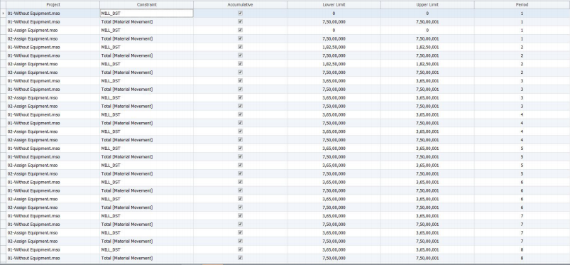
The result was a big change, Now the data became more sensible and easy to understand.
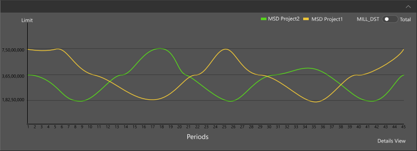
Well Designed data visualization have a purpose to present data clearly and consistently. A good Dashboard design will flow the data naturally from left to right, use wide margins and padding and display the right amount of information
Dashboards
Dashboard design is the ability to compile and display crucial data/information into a single, viewable space. It fallows UX design principles and data visualization best practices, and it is organized so users can navigate directly to various areas that require the most attention.

Chunking and Grouping the Data
Chunking is process by which individual pieces of information set are broken down and then grouped together in a meaningful whole. The chunks by which the information is grouped meant to improve short-term retention of the information through bypassing the limited capacity of working memory.
A chunk is a collection of basic familiar units that have been grouped together and stored in a person’s memory. These chunks are able to be retrieved more easily due to their coherent familiarity. It is believed that individual create higher order cognitive representations of the items within the chunk. The items are more easily remembered as a group than as the individual items themselves.
People learn better when a complex continues lesson is broken into separate segments. Examples include breaking a complex figure into two or more smaller figures dealing with different parts of the original one, presenting one graphic at a time rather than putting multiple graphics in the same figure or breaking a continues presentation into short chunks than can be paced by the learner. The learner's working memory is less likely to be overloaded with essential processing when the essential material is presented in bite-size chunks rather than as a whole continuous lesson.
Some of the examples of chunking:
Phone Numbers:

In the above examples scenario-2 is easy to remember when compared to 1, as the information is chunked into small numbers where the user can remember the small chunks easily.
Grouping the Items:
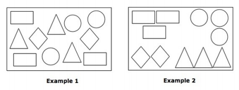
In the above example items in the Example-2 is easy to identify when compared to 1, as the items are grouped based on their shapes.

4 - ACCORDION ELIMINATE ALL POINTS OF CONFUSION AND MISINTERPRETATION
An accordion menu is vertically stacked list of headers that can be clicked to reveal or hide content associated with them. It is one of many ways you can expose content to users in a progressive manner. Allowing people to have control over the content by expanding it or deferring it for later lets them decide what to read and what to ignore. Giving people control is #3 on the list of the top heuristics for usable design. In theory, this concept sounds reasonably human centred.

The proposed design.
