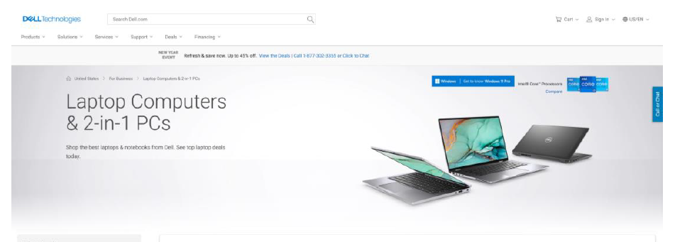
Category page is a sub-page in Dell.com where the products are listed according to their configurations and specifications based up on the user choice.
As a lead designer i have to colloborate with the stakeholders to research and conduct userinterviews and get engaged with various teams in conceptualisation of the ideation into design.
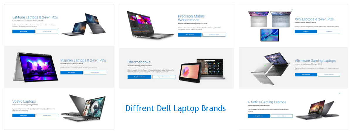
After referring to various VOCASS comments by the sales team we were presented with a problem that, customers have a challenge in understanding different laptops like Inspiron, Precision, Vostro and all other laptop brands in the Dell portfolio while making purchase.
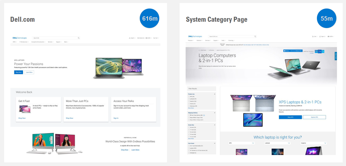
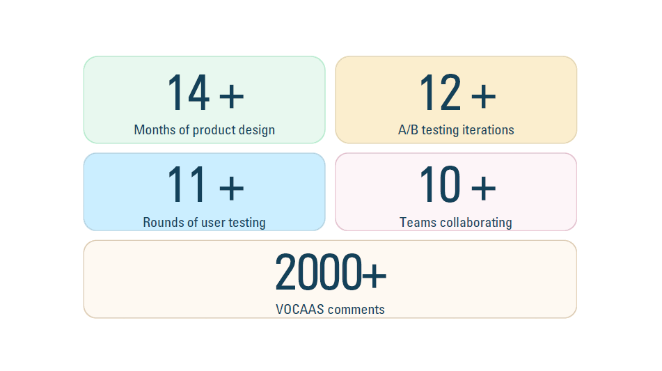
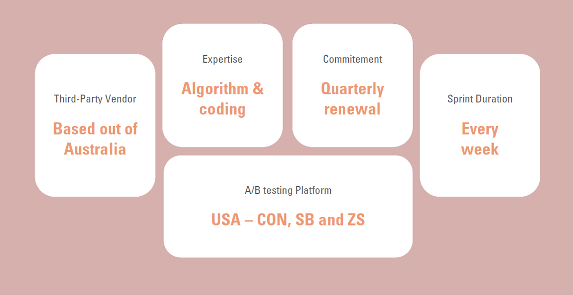
After every design iteration and every round of A/B testing we took the designs to the users to validate them at every stage of the process. I believe it is our biggest superpower that we keep talking to real users.
we had started with around 11 user interviews and noted down all the steps and scenarios where the users are actually facing difficulties and confusion in the page.
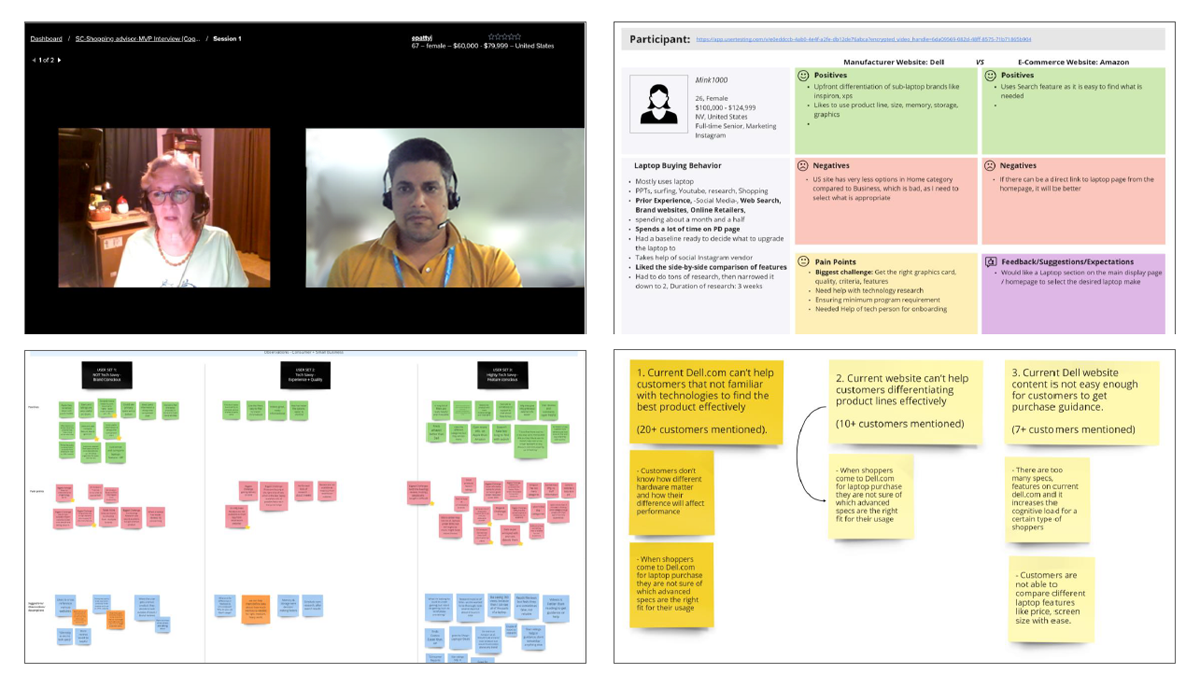
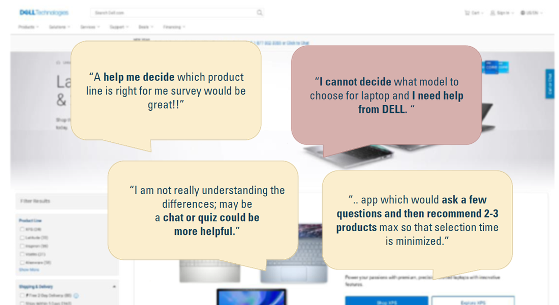
• Customers are not familiar with technology.
• Customers can't differentiate between product lines.
• Content is not easy enough to get the guidance they need.
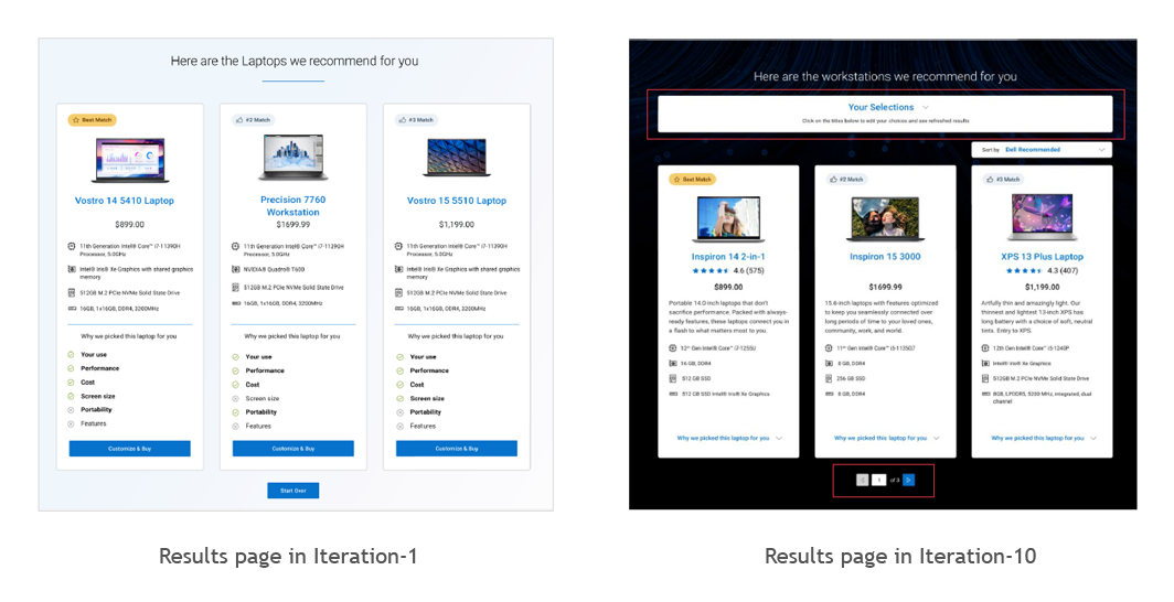
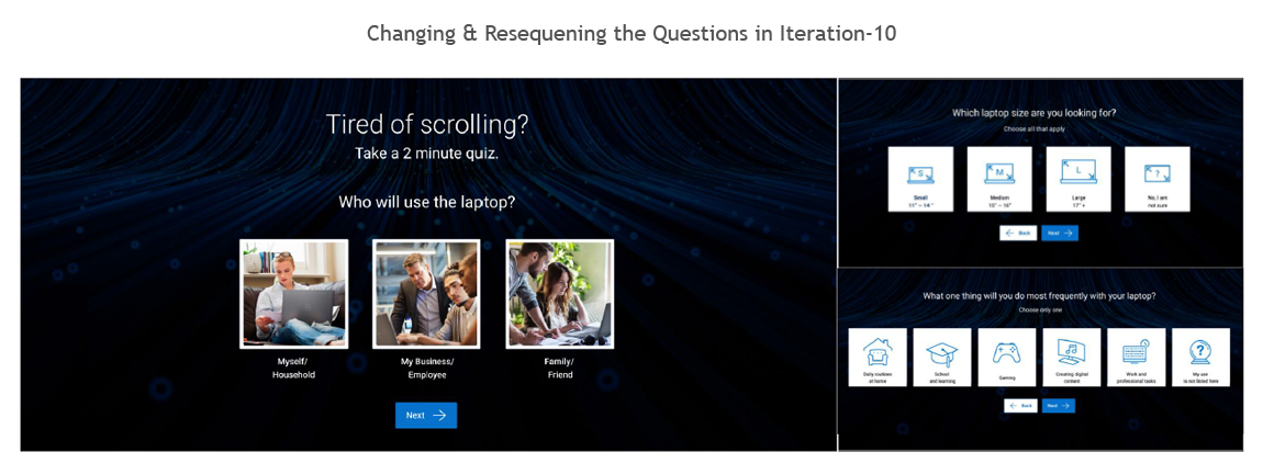
we tried to do the design and content changes along with re organizing the orders of the elements to match the user expectations
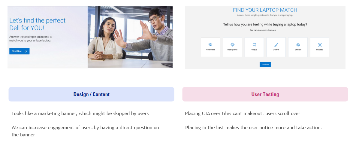
we made all the teams involve in the early stage of research to identify the issues, instead going back to and fro.
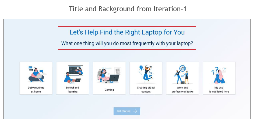
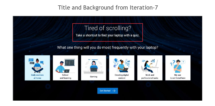
Came with different design iterations based on the user feedback like adding CTA`s, banners and different images which grab the user attention.
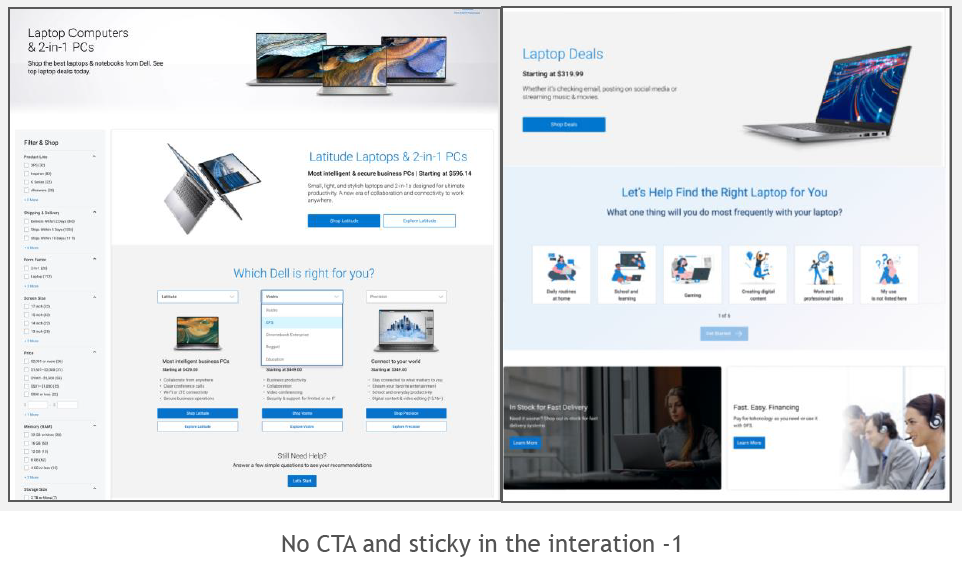
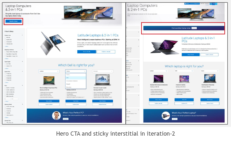
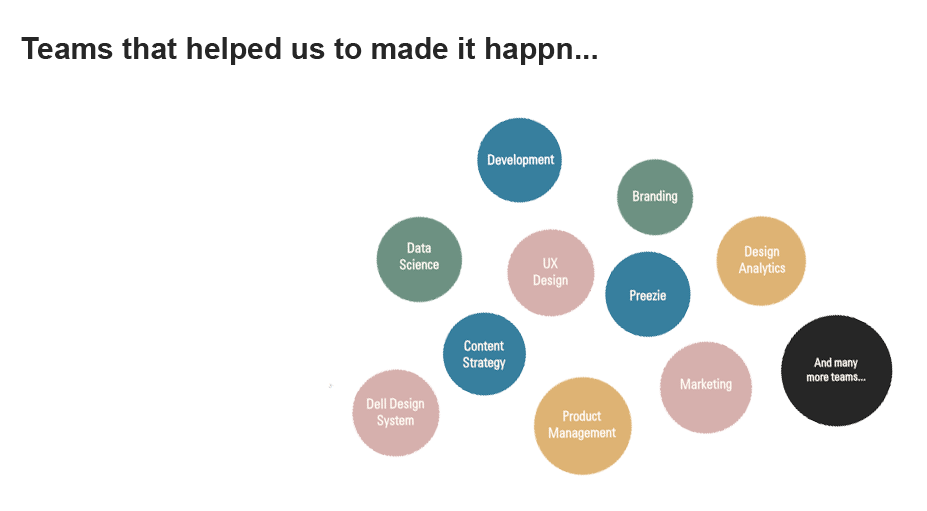
We tried engage with teams like engineering, data analytics and product management but also marketing , content
strategy branding accessibility , behavioural data science along with some third party tools to understand the user needs!
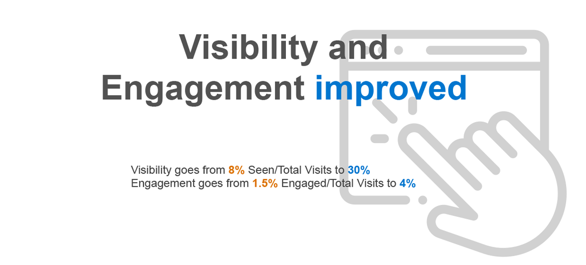
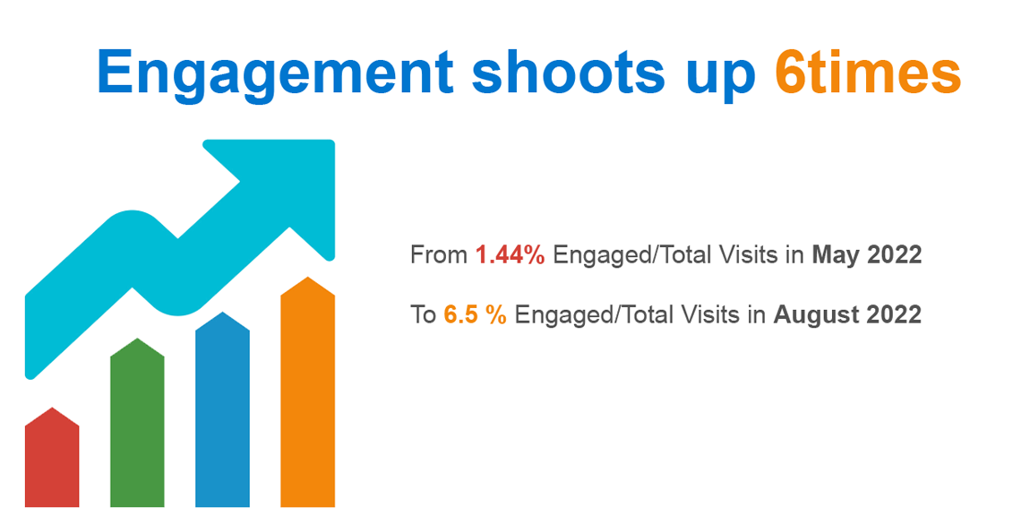
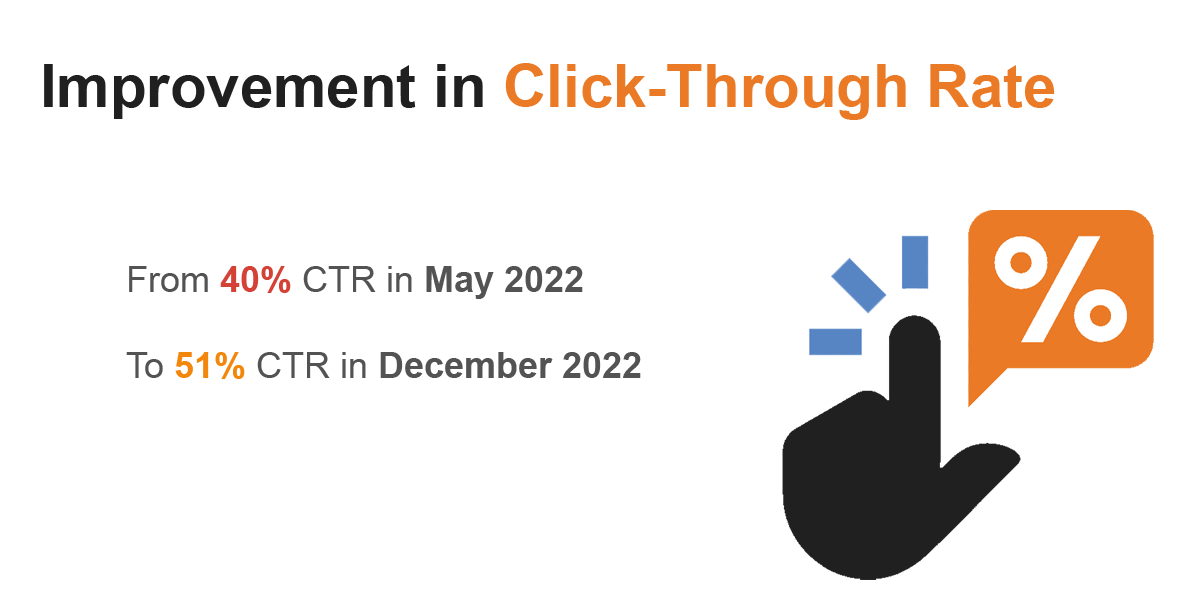
with surprise this engagement have helped us a lot in designing more iterations.


Its always good to do the surround research where we can find some serious inner lining issues.
Failing early in design process will have a chance to learn fast and deliver the best.