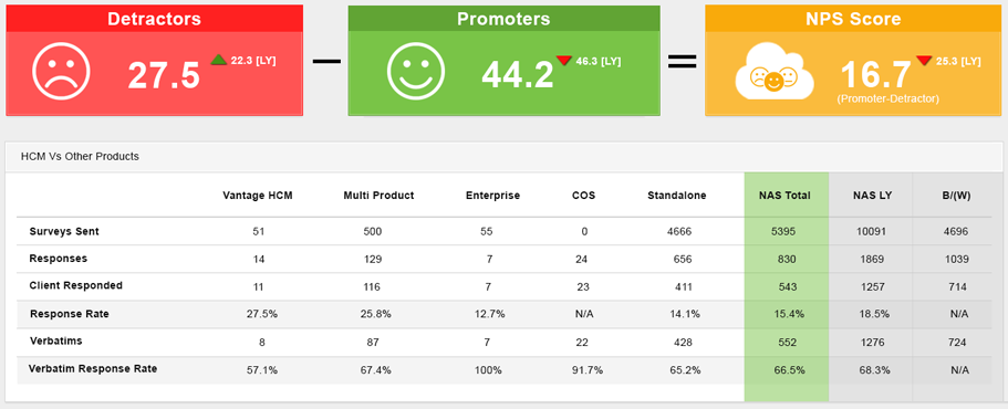
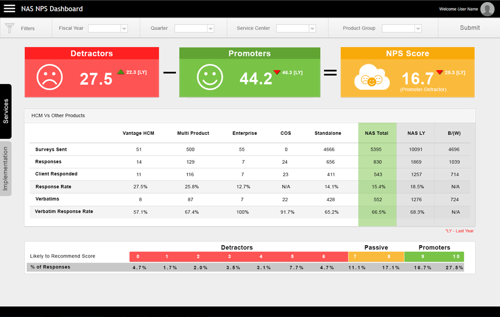
NAS NPS Dashboard is a responsive and user interface (UI) rich web-based application created to access the NPS scores data anytime, anywhere. It acts as a visualization tool with multiple views based on the filters date, Service Center (NSC), and Product Groups.

Project Overview
Vision
Business want to have all NAS NPS scores to be viewed by authorized stakeholders seamlessly, without defects, where everyone is aware and informed of the outcomes, trends, and status.
Issue Statement
Today we have excel spreadsheets downloaded from Cognos and Allegiance data sources in multiple formats that result in too many rollback failures
Resolution
Develop a web-based application to help view your scores and trends.
Role
User research, user interface design, interaction design & Visual Design
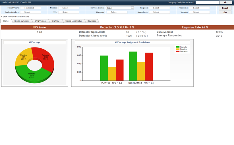
Existing tool
We tried to understand the existing tool which is already in place and serving the users needs.

Understanding the Requierments
After reviewing the existing tool and discussions with the stakeholders we have got some insights on the requierements and their expectations from the new design.
What they Want
The stakeholders are not keen on the design and presentation so i took the liberty to go beyond the limits and come up with the solution that meet the stakeholders requiermenst and could solve the current design issues.
What is the Solution
This is my first project as UX desiger and new to the UX process took my time in understanding the UX process and methods, there were no inputs from the stakholders as they were not with the design which made me to do some research in thinking about the solution. As a part of research did some huristic research methods like Competitive Analysis, Recognition rather than recall, Match with trend, and Design consistency and standards
Competitive Analysis
is a field of strategic research that specializes in the collection and review of information about rival products. It is one of the tactic for finding out what your competitors are doing and what kind of methods they present to their products success.
is a field of strategic research that specializes in the collection and review of information about rival products. It is one of the tactic for finding out what your competitors are doing and what kind of methods they present to their products success.
Internet was only source for me to do the Analysis gone through various dashboard designs which represent NPS and tried to understand the way of presentation and alignment of data.
Recognition rather than recall
Minimize the user's memory load by making objects, actions, and options visible. The user should not have to remember information from one part of the dialogue to another. Instructions for use of the system should be visible or easily retrievable whenever appropriate.
Minimize the user's memory load by making objects, actions, and options visible. The user should not have to remember information from one part of the dialogue to another. Instructions for use of the system should be visible or easily retrievable whenever appropriate.
One of my favourite method and i really like the concept behind it which is true and we use it and think about it in various actions we do in our daily life. My point was clear that user should aware what is he looking for and the purpose of visting the site, i tried to bring the data upfront so the users can easly percive the information rathar than digging inside the site.
Match with trend
The system should speak the users' language, with words, phrases and concepts familiar to the user, rather than system-oriented terms. Follow real-world conventions, making information appear in a natural and logical order.
The system should speak the users' language, with words, phrases and concepts familiar to the user, rather than system-oriented terms. Follow real-world conventions, making information appear in a natural and logical order.
When i was tring to have the walkthrough with the existing design first thing which came in my mind was to revamp the look totally i felt the design was very old and no where matching with current trends, When i was doing Competitive Analysis the research also gave me more insights on the design.
Design consistency and standards
Users should not have to wonder whether different words, situations, or actions mean the same thing. Follow platform conventions.
Users should not have to wonder whether different words, situations, or actions mean the same thing. Follow platform conventions.
As a designer i tried to give justice to the site in the form of Interaction, alignments, placements and visuals i tried to give visual treat to the site where it can imporove the adoption, self learning and affordance of the elements.
Fnial Design

The response was great it was a surprise package for the stake holders and they were very happy with the design approach and ready to implement with out any more questions or suggestions which made the team get few more projects from the same stakeholders.
Learning
This was my first project as a UX designer which gave me lot of scope to do the research on products and understand user needs, and i had got a chance to learn a lot of design trends. I had an oppurtunity to work on huristic research methods which was another learning skill. This was also my first time designing a dashboard and it was a great learning experience.